

What Ssar'ney said, the characters online thing is unreadable, because of the light font and the bright picture behind it. Either move it down one line, or get another font-colour. I REALLY like the new page. I absolutely adore it, and I have personally been wondering when we'd get something new instead of our old-fashioned screen-filling website we have now.
The new design fits modern standards a tad more. =)
New Homepage Design
Moderator: Gamemasters


-
Achae Eanstray

- Posts: 4300
- Joined: Tue Sep 19, 2006 7:03 am
- Location: A field of dandelions
- Contact:
Thank you, yes, it is true type, I can send it if you would like. The color was done with a photoshop style originally but added some modifications to tie in the grey/silver of the bar with yellow/gold of the rest of the page.Alatar wrote:Did you use a true type font? (I like this one).Achae Eanstray wrote:Just posting this one real quick, will try some others later
A different size on the lettering as suggested by Kadiya IMO looks nice, but I have both sizes saved on a psd file.

-
Greisling

- Beginner NPC Scripter
- Posts: 156
- Joined: Sun Nov 04, 2007 10:50 pm
- Location: Go for more communication between Players and Staff
I like the new layout and prefer it to the current one in general. 
Some comments:
- For me there are currently to many colors used in the whole design: green, black, gold, yelowish white, brown and the pergament style.
Maybe we need one main color?
I would prefer the nice mysterious green
- The backround is too dark in my opinion. Just leave a small line in the bottom. Maybe ust the "golden cut" to make the change between greenish and black?
- Maybe we can arrange and sort the different sections in a better way? At the moment it still is a bit confusing to me, when it think of me being newbie. Don't have a proposal though.
- I think we need a button in the top (maybe in the silver ball) to start the game immediatly.
- The silver ball could show the same IG spot on many different day times, reflecting the actual IG time.
Hope that helps,
Regards,
Greisling

I like it. I -really- like it.
I think there needs to be a little something more in the bar, between Illarion, and the online players. Or maybe center Illarion, and put the online thing underneath. Perhaps we could have the background of that, change to different enviroments in Illa? Troll's Bane with people, a scene with the knights, a priest giving a discussion, the graveyard, all sorts of things! Or do that for the screenies. But it may be too much work.
Just a few ideas.

-
Taeryon Silverlight

- Posts: 771
- Joined: Fri Oct 20, 2006 10:35 pm
- Contact:
I don't think we should show screenshots in the little ball with the online-players on it. The graphics are so bad that newbs could be scared off while the foggy forest looks pretty neat.
One thing I'd change is the frame (? dunno if it is one) with the text-content in it. If there should ever be a very long news or anything, it'll look unbelievably stupid. I think a scrollable contentbox would be nicer.
One thing I'd change is the frame (? dunno if it is one) with the text-content in it. If there should ever be a very long news or anything, it'll look unbelievably stupid. I think a scrollable contentbox would be nicer.

-
Taeryon Silverlight
- Posts: 771
- Joined: Fri Oct 20, 2006 10:35 pm
- Contact:
-
jregan91

- Posts: 129
- Joined: Thu Feb 09, 2006 1:56 pm
- Location: here there when i find a map ill tell you
- Contact:
AlexRose wrote:Taeryon, newbie’s are going to look in the screenshots section before they play the game. Everyone does. And then, they're going to PLAY THE GAME. It's not a matter of "oh once we've got them in game they won't quit, so just don't let them see what it looks like until then".
No I agree with Alex on this one with any game i have played I have always looked at the screen shots first just to get a feeling of the type of game I am going to possibly play. If we improve the screen shots to display all forms of fun activities such as crafting? farming? Monsters? Magic? It will surly attract new players. I love the screen shots some are very good but why not have a category dedicated to quests? i.e. the best screen shot taken throughout a particular quest or event gets put up or best magic demonstration? I have seen screenshot topics here o the forum but a new comer is not going to see a forum straight away.
-
Juliana D'cheyne

- Posts: 1643
- Joined: Sat Jan 06, 2007 9:14 am
- Contact:
Does the main page have to encompass all though? That may make it too jumbled. Why not links to other important things a new player will look at like the screenshots, news etc.?
(I like the idea of a section for player screenshots that particularly shows the RP, I have seen some VERY good RP that would be very interesting to new players...possibly with approval of a gm before the screen shot is posted...and screenshots of crafting along with fighting and magic would definitely be nice)
(I like the idea of a section for player screenshots that particularly shows the RP, I have seen some VERY good RP that would be very interesting to new players...possibly with approval of a gm before the screen shot is posted...and screenshots of crafting along with fighting and magic would definitely be nice)
-
Taeryon Silverlight
- Posts: 771
- Joined: Fri Oct 20, 2006 10:35 pm
- Contact:
-
Christopher..Rigden

- Posts: 103
- Joined: Wed Aug 20, 2008 10:57 pm
- Location: Way back home...

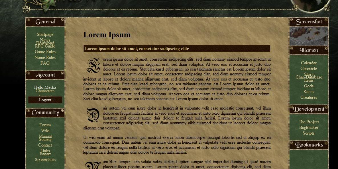
Now thanks to Achae the design of the homepage improved further. Still we
have a problem area some do not really like. Namely it is the orb in the
upper right area. The graphic of this orb many do not like.
We are looking for better idea to replace that orb.
The URL again: http://illarion.org/test.php
~~~~~~~~~~~~~~~~~~~~~~~~~~~~~~~~~~~~~~~~~~~~~~~~~
Dank Achae hat sich das Design der Homepage in den letzten Wochen weiter
verbessert aber wir haben noch immer Bereiche die nicht wirklich gemocht
werden. Es handelt sich bei dem Problembereich um den Kugel im rechten
oberen Bereich der Seite. Wir hoffen auf Ideen für verbesserungen dieser
Grafik.
Normal die URL: http://illarion.org/test.php
Nitram
-
Dantagon Marescot

- Posts: 1948
- Joined: Mon Sep 04, 2006 8:38 am
- Location: Illarion Public Library
It looks very nice, but I am resuggesting (since no one listened in the first place), for either a map of Illarion or Gobaith to go in the place of the orb. It would make a bit more sence and could be treated as a globe. It wouldn't have to be a complete map, but it is something other than a screen shot which could turn out blurry and difficult to view.
-
Estralis Seborian

- Posts: 12308
- Joined: Wed Nov 10, 2004 9:14 pm
- Location: Sir Postalot
- Contact:
I like the orb as it is, but the text in it is disturbing  . Maybe put the Statistics in the right menu column, above or below screenshots?
Something tiny: You should use a new favicon, it still shows the dwarfess with red panties (damn, I miss those avatars!).
One last thing: The bottom line ("Webmaster: Jan Falke"...) could use a smaller font. And: Copyright 1997-2009 by Illarion e. V.
All in all: An up to date design, calm and an awesome background. The Illarion logo almost looks too good for a free, non commercial game .
.
Something tiny: You should use a new favicon, it still shows the dwarfess with red panties (damn, I miss those avatars!).
One last thing: The bottom line ("Webmaster: Jan Falke"...) could use a smaller font. And: Copyright 1997-2009 by Illarion e. V.
All in all: An up to date design, calm and an awesome background. The Illarion logo almost looks too good for a free, non commercial game
Well yes but thats something for the very final partEstralis Seborian wrote:Something tiny: You should use a new favicon, it still shows the dwarfess with red panties (damn, I miss those avatars!).
Like this?Estralis Seborian wrote:One last thing: The bottom line ("Webmaster: Jan Falke"...) could use a smaller font. And: Copyright 1997-2009 by Illarion e. V.
http://img.photobucket.com/albums/v120/ ... /Error.jpg
Notice the links. I am using Firefox 3 incase you are curious.
Notice the links. I am using Firefox 3 incase you are curious.